Now, I have to be honest. I created this tutorial 2-3 years ago and I struggled with it for a long time, trying to get it right. As I went back, I spent a lot of time trying to figure out what I did in the first place and even ran into some of the same errors as I did the first time. For this navigation bar, I used HTML Dog for the main part of the tutorial and various other help forums to figure out some of the rest. While I can give good explanations for most of the tutorial, there are some parts that I don't completely understand. Also, I am not a professional web designer. Some of my modifications are probably not be the best practices for web design. But for a beginner, they get the job done.
If you don't know anything about HTML/CSS, this tutorial may be difficult for you. I have given some explanations and links that should get you through the tutorial, but if you need to make additional modifications, you may have trouble. Creative Bloq has a list of the Top 20 Online Training Resources for anyone interested in learning more about web design. I have used #1 and 10 from that list and recommend those for beginners.
For this tutorial, I created a new navigation bar, similar to the one on my blog. I am using the Blogger Simple template that was customized in my tutorial on How to Make Your Own Custom Blog Template. You can look at the actual navigation bar on my Practice Blog. Here is a preview:


Want the full tutorial? Keep reading!
Before you start the tutorial, be sure to back-up your template. Read my tutorial here on How to Back-up Your Template.
Like most web tutorials, there are two parts of code that you need to build/add to your blog, HTML and CSS. The HTML is the framework for the navigation bar and the CSS is the part that styles the navigation bar (CSS: Cascading Style Sheet)
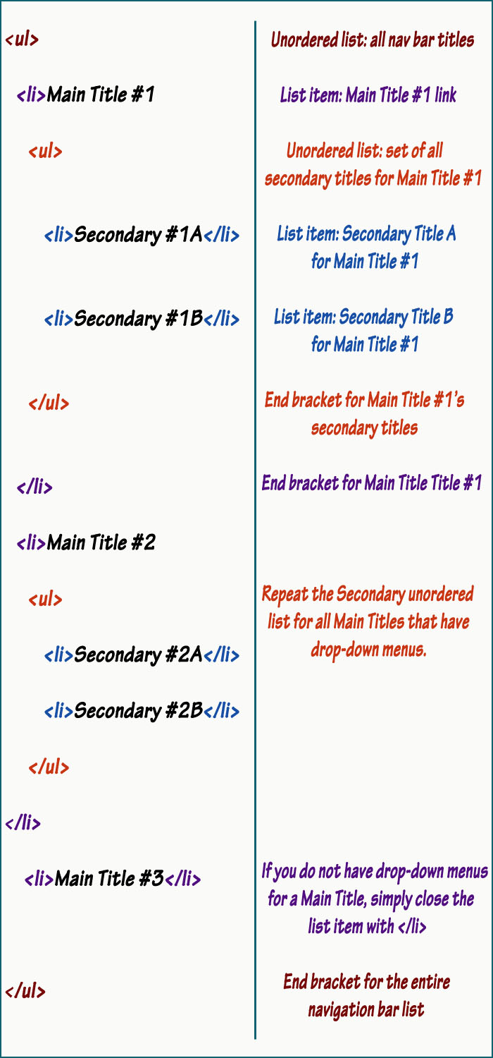
I. HTML for Drop-Down Navigation Bar
To create your navigation bar, you need to learn a little HTML first. Navigation bars are usually made as lists. Your lists will consist of your Main Titles and your Subcategories. On my blog, my Main Titles are Home, Free Designs, Custom Designs, Tutorials, Terms of Use and About Me.The Secondary Titles are the titles that show up when you hover over these Main Titles. Under my Free Designs title, my Secondary Titles are Free Backgrounds, Free Headers and Free Templates.
In HTML terms, we are going to use unordered lists. (Go to w3schools to learn more about lists.)
The entire list of links (Main Titles and Secondary Titles) will be an unordered list that starts with <ul> and ends with </ul>.
Within the main unordered list (our entire list of links) are several list items (our Main Titles). Each list item starts with <li> and ends with </li>.
So far, your HTML would look like this:

To have Secondary Titles below these Main Titles, you have to create a new unordered list (starting with <ul> and ending with </ul>) within each Main Title. Each of these unordered lists represent the entire set of Secondary Titles for a particular Main Title. Therefore, you need to have list items (starting with <li> and ending with </li> within the Secondary unordered list. Each of these list items represent a specific Secondary Title. So adding on to the HTML above, we would have:
Now, if we enter our links as shown above, the words for each title will show up but they will not be linked to anything. The HTML for links is
<a href="URL">Text</a>

You can copy the code below and modify it for your blog:
<ul>
<li><a href="URL to Main Title #1">Main Title #1
<ul>
<li><a href="URL to Secondary Title #1A">Secondary #1A</a></li>
<li><a href="URL to Secondary Title #1B">Secondary #1B</a></li>
</ul>
</a></li>
<li><a href="URL to Main Title #2">Main Title #2
<ul>
<li><a href="URL to Secondary Title #2A">Secondary #2A</a></li>
<li><a href="URL to Secondary Title #2B">Secondary #2B</a></li>
</ul>
</a></li>
<li><a href="URL to Main Title #3">Main Title #3</a></li>
</ul>
This HTML needs to be added just below your header. To do this, go to your Layout page and click "Add a Gadget" and choose "HTML/JavaScript". Enter your code into the gadget and click Save.
II. CSS for Drop-Down Navigation Bar
This list so far will not look right. This kind of list will be somewhat vertical. To make it horizontal, you need to adjust it using CSS. |
| Even though you haven't labeled it in your HTML as a navigation bar, your blog will assume it is. This means that you can adjust those Border Lines and the Font in the Template Designer under "Tabs Text" and "Accents" (then adjust "Tabs Border Color") . |
 |
| The same navigation bar with the changes mentioned above. I also adjusted the color. |
For my blog, I used a tutorial at HTML Dog. The post is called Son of Suckerfish Dropdowns. Please read this post under the title Single-level Dropdowns to get the CSS as I am not at liberty to copy their styling in my post.
The first section in the Son of Suckerfish tutorial is pretty standard HTML that I explained in part 1 above, but the second section, the CSS styling is all theirs. I don't understand all of it but I will share with you the changes I made to accommodate my blog and why.
A. To add their CSS, go to your Template page and click "Customize" (the orange button). Click "Advanced" in the far left column. Scroll to the bottom of the second column and click "Add CSS". You can enter the CSS code from the Son of Suckerfish tutorial there. (If you already have coding there, be sure to scroll to the very bottom before adding code.)
Make sure that you copy the correct coding. You are only copying the CSS code. HTML coding starts and ends with elements in brackets, like this:
<ul>
<li>Text</li>
</ul>
CSS coding starts with a title followed by an open curly bracket and ends with a closed curly bracket:
#nav {
margin: 10px;
}
So start in the second box of their tutorial that starts with #nav... and copy the CSS from all the boxes (including the JavaScript in the second to last box) all the way until you get to Multi-level Dropdowns.
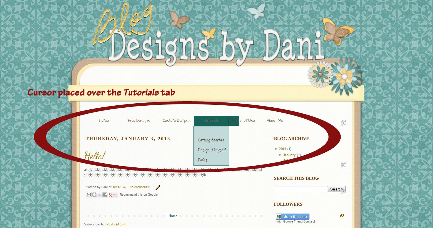
This CSS should do something similar to what you see below to your navigation bar:
 |
| My cursor was placed over the Tutorials tab to show you the drop-down menu. |
B. Clearly we need to make a few modifications. Follow along with me as I adjust the CSS. You can copy any of my changes or leave them alone depending on your preference.
First, I am going to share the simple design modifications like colors, backgrounds and fonts:
1. The CSS id #nav, #nav ul alters the entire navigation list. The "ul" refers to the large unordered list covering all the titles. (Read more about CSS "Id's and Classes" at w3schools.)
Under this id, I added a color attribute to the text. You can either add a specific color in the code or you can add a variable that will allow you to change the color in the Template Designer.
a. If you just want to add the specific color, add the following line under #nav, #nav ul {
color: #6-digit color code or HEX code;
for example:
color: #c2dbda;
for example:
color: #c2dbda;
*There are tons of websites that can help you find a color code for this. Here is one site that is easy to use: http://www.colorpicker.com/*
b. Or if you want to add a variable that can be changed in the Template Designer (under "Tabs Text" and then "Text Color"), add this line instead:
color: $(tabs.text.color);
*Note that this variable is for the Simple Template, you will need to find your Tabs Text Color for your specific template. My previous tutorial HERE explains the variables in your HTML. *
2. The next CSS id is #nav a. Remember the "a" that was used in the HTML to add links to everything? Well this is the same "a". It refers to all of the links in your navigation bar. We can give our links a new color whenever you place your cursor over them. This shows your readers that it is a link and not just text.
In the Template Designer, the Tabs Text Selected Color is under "Tabs Text". To include this in our code, under #nav a { you can add the same color line as in part 1 above or add the following line to be able to modify the color easily in the template designer:
color: $(tabs.selected.text.color);
*Again, remember this is for the Blogger Simple template. I can't guarantee this works in other templates.*
3. Under this same id, #nav a, add the following line to change the font:
font: $(tabs.font);
*This uses a variable instead of an actual font, so that you can modify it easily in the Template Designer. To learn how to manually add fonts, go to w3schools.*
*If you used variables for your colors and fonts, be sure to change them accordingly in the Template Designer.*
*If you used variables for your colors and fonts, be sure to change them accordingly in the Template Designer.*
4. When I hover my cursor over my Main Titles, my Secondary Titles should appear. To make them easier to read, I want to add a background color to them. The id #nav li:hover ul is the one that modifies the "ul" or unordered list that is within the "li" or list items. So this is the set of Secondary Titles when you hover over the "li" or Main Titles. So under this id, add the following line to add a background color:
7. On my blog, I used my header image to create a background for my navigation bar. On Blog Designs by Dani, the blue scallop is part of my header.

On my Practice Blog the yellow ribbon is part of my header.

With the code as it is now, my navigation bar sits below this yellow ribbon.

In order to push it up onto my header and the yellow ribbon, I needed to add the following code to the id #nav, #nav ul
background: #6-digit color code or HEX code;
for example:
background: #c2dbda;
for example:
background: #c2dbda;
*There are tons of websites that can help you find a color code for this. Here is one site that is easy to use: http://www.colorpicker.com/*
5. I also wanted a border around these backgrounds to give it a crisp look. Here is the line I added to this same id as step 4:
border: #6-digit color code or HEX code solid 2px;
for example:
border: #5a908b solid 2px;
for example:
border: #5a908b solid 2px;
6. Notice in the picture above that there is also a background behind the Main Title that is Selected. If you move the cursor down to any of the drop down options, it will place that dark color (or whatever color you choose) as the background to the selected link. If you like this, then leave it as is. Otherwise, go to your Template Designer and under "Tabs Background" and then "Selected Color", choose "Transparent".
Alright, now let's make some spacing modifications:
7. On my blog, I used my header image to create a background for my navigation bar. On Blog Designs by Dani, the blue scallop is part of my header.

On my Practice Blog the yellow ribbon is part of my header.

With the code as it is now, my navigation bar sits below this yellow ribbon.

In order to push it up onto my header and the yellow ribbon, I needed to add the following code to the id #nav, #nav ul
margin-top: -93px;
****Be sure to add this line AFTER "margin: 0;" or it won't work. ****
*Margin usually is used to place a margin or space between two design elements, like the header and navigation bar. However, if you want things to overlap, you can use negative numbers to move the margin in the opposite direction. You will probably need to adjust this number depending on the spacing in your blog. To learn more about margins, go to w3schools and learn about the box model and margins.*
8. If you want to move your navigation bar to the left or the right, you can adjust the margin-left under this same id as in step 7. Add the following line to do so:
To reset this and place them below the Main Titles, I added this line to the id #nav li:hover ul
In step II-B-7, I showed you my header image. If you would like to know how I created my header to fit my nav bar, here is a little preview of the different elements in my header:8. If you want to move your navigation bar to the left or the right, you can adjust the margin-left under this same id as in step 7. Add the following line to do so:
margin-left: 5px;
*Positive values will move it to the right, negative values to the left. *
****Again, be sure to add this after "margin: 0;" or it won't work.****
9. When I got to this point, my drop-down menus were acting weird and when I hovered over the Main Title, the drop-downs would show but would cover the Main Titles. They were sitting on top of or even above these Main Titles, instead of below them. What is even more frustrating is that different browsers will position it differently.
****Again, be sure to add this after "margin: 0;" or it won't work.****
 |
| Navigation bar shifted up onto the Yellow Ribbon on the Header. |
9. When I got to this point, my drop-down menus were acting weird and when I hovered over the Main Title, the drop-downs would show but would cover the Main Titles. They were sitting on top of or even above these Main Titles, instead of below them. What is even more frustrating is that different browsers will position it differently.
 |
| Drop-downs not positioned correctly |
To reset this and place them below the Main Titles, I added this line to the id #nav li:hover ul
margin-top: 0px;
*You can adjust this up or down but be careful that your drop-downs do not get too far below your Main Titles. If they do, then by the time you move your cursor down to the Secondary Titles, the titles will disappear.*
 |
| All better...almost! |
Now let's do a few more spacing modifications, but this time, just altering the width of specific elements.
10. The id #nav li represents the Main Titles in your navigation bar. If you adjust the width of this, you will increase or decrease the space between your Main Titles.
11. The id #nav li ul represents the drop-down lists. Adjusting this width will adjust the width of the drop-down menus.
Finally, the last glitch I found was a pretty big one.
12. After doing all these modifications, I found that when I tried to select one of titles in my drop-down menu, the menu would disappear before I could click on it. I also noticed that my drop-down menus are sitting underneath the text of the blog, like the date header and post title.

If you add this line of code to the id #nav, #nav ul, both problems are fixed:

If you add this line of code to the id #nav, #nav ul, both problems are fixed:
z-index: 999;
 |
| Drop-downs are now sitting above the rest of the blog elements. |
C. If you used variables to adjust colors or fonts (as in steps 1-3) or if you would like to remove border lines, you need to make these adjustments in the Template Designer.
If you have the Simple template, make sure you are in the Template Designer and find Tabs Text. Adjust the font, font size, text color and selected color.
Then go to Tabs Background and make sure the background color is transparent (if you are using your header as your background, like me).
Then click Accents and make sure the separator line color and the tabs border color are transparent (if you are using the header as your background, like me).
D. If you still notice that there is a border line between your Main Titles, get out of the Template Designer and go to your Template page. Click Edit HTML. Do a search (CTRL-F on a PC) for Variable name="tabs.border.width". You should see the following lines:
<Variable name="tabs.border.width" description="Tabs Border Width" type="length" default="1px" value="1px"/>
<Variable name="tabs.bevel.border.width" description="Tabs Bevel Border Width" type="length" default="1px" value="1px"/>
<Variable name="tabs.bevel.border.width" description="Tabs Bevel Border Width" type="length" default="1px" value="1px"/>
Change the values of both so that it reads value="0px":
<Variable name="tabs.border.width" description="Tabs Border Width" type="length" default="1px" value="0px"/>
<Variable name="tabs.bevel.border.width" description="Tabs Bevel Border Width" type="length" default="1px" value="0px"/>.
<Variable name="tabs.bevel.border.width" description="Tabs Bevel Border Width" type="length" default="1px" value="0px"/>.
Preview it and then Save Your Changes.
*There is one more problem that I cannot figure out. When I view my Practice Blog in Internet Explorer, the drop-down menus appear on the side instead of below. They are still accessible, they just look weird. They look fine in Firefox, Chrome and Safari. If any of you figure it out, let me know!
III. Creating a Header with a Navigation Bar Background
*There is one more problem that I cannot figure out. When I view my Practice Blog in Internet Explorer, the drop-down menus appear on the side instead of below. They are still accessible, they just look weird. They look fine in Firefox, Chrome and Safari. If any of you figure it out, let me know!
 | |
| Drop-downs sit beside the Main Titles instead of below. No idea why!? That's Internet Explorer for you, I guess. :) |
III. Creating a Header with a Navigation Bar Background

The ribbon consists of a ribbon from Katie Castillo's scrapbook kit at Just So Scrappy called "Fresh Squeezed". The ribbon was originally a scallop, but I cropped off the scalloped portion so that it was just a rectangle. I then added two more of the same ribbon and angled them so that the ribbon looked like it was wrapping around the middle of my blog. I placed the angled ribbons below the middle section as shown below:

Well, that's it! Here is the finished navigation bar or you can check out on my Practice Blog.

I can answer a few questions in the coming week or two but after that, I probably won't be checking in often. I will still allow you to post comments so that other readers may answer your questions. Good luck with your blogs!


hi dani, i tried to move my drop down list, but my background follow it.. :< how to stop the background following? just the drop down list that move?
ReplyDeleteI really dont know how to do it.. can you help me please.. i just need to combine the ribbon and the menu bar..
ReplyDeletehello, i recently opened a blog and so i need some help with the html and web design cos i dont know much about it... please can anybody help me out? i would have contracted a web designer but being only a student, i cant raise the huge amount of money i am being asked to so any help and?or tutorial i can get from this blog would be highly appreciated.
ReplyDeleteHey, great tutorial, but one little thing
ReplyDeleteIn the unordered list HTML it starts with < ul >, when it should read < ul id ="nav" > or the CSS won't work. It took me forever to figure out what was wrong!
Hopefully this help out anybody who's stuck. I love the tutorials on this site, keep up the good work
You saved me! I could NOT figure out why it wasn't working, but finally scrolled through the comments and found yours. You're a lifesaver! :)
Deletehi everyone. I am in middle of creating and design blog. And i am trying to create drop down menu. i have 2 problems.
ReplyDelete1. when i enter code at Layout page and click "Add a Gadget" and choose "HTML/JavaScript".
- all Main Titles and secondary titles appear all in one line. Which suppose to be secondary titles inside/under Main titles. Please advise.
2. next step when i go to design/templete - edit html , enter html code above the b skin command, all the code that i paste == pop up/shows at the top of my blog
Hope anyone can help me. thank you very much
An attractive looking website compels the visitors to stay for longer, and have a look at the products or services carefully. It helps reducing the bounce rate, and gaining better chances of selling online. Moreover, a web designer should be able to choose a template that matches with the business niche, and customize it excellently, as per the current trends. Reynolds Digital helped me to follow several other criterion that helped creating an awe inspiring website, and becoming a proud owner of an online shop without facing any difficulty.
ReplyDeleteIt's amazing how well the drop-down bar holds up over the years. Definitely one of the best beginner-friendly tutorials out there! Thanks for sharing this valuable resource—your hard work is much appreciated!
ReplyDeletedata science internship |
python internship |
artificial intelligence internship |
java internship |
cyber security internship